Imagine Worlds - Concept art
Moving on from the thumbnails i then took my chosen picture and began to develop it in Photoshop.
 I did the outline first along with a base of where i wanted the greenery to be, the red lines are to help show what angle the ship is going down at and so the edges line up.
 The first thing I colored was the sky, a teacher did give me help with choosing the colors ad how the light should reflect on the clouds, over all I am very happy with how this turned out but next time I would add more highlights further up the clouds.

I then moved onto the watch tower, I did the base colors first and put dark colors where I knew there would be more shadows.
 I started shading in the tower and adding highlights.

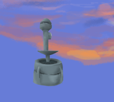
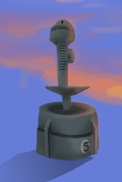
This is the full shaded tower, I used a textured brush when smudging but I had difficulty doing so as I really don't like Photoshop's blending tools and prefer Krita's as it gives a much smoother finish and blends it in easier. I also added in Windows and some smaller details like the number.

Next I got a image of a grate from google and put it in the center of the tower next to the first pole, although its barely noticeable you can still see its got some detail. I also added in a glow from the sun and a shadow.
 I then started on the drone, this is the base colors for it.
 I added in some shading and highlights where the sun is coming from.

I once again went on Google and got an image of drone fans/blades and then edited them on using the warp tool.

For the final part of the drone I added in the glow again form the sun and I used a gradient to make it look like the drone has a search light.

Moving onto the ship I did a basic one that I'm not too happy about.
 I went back and edited the ship from its previous form. I got rid of the red circle and changed the blue part to a gradient.

Then I added in grates to the side of the ship and random details to try and fill up the space. I also gave the blaster at the back an effect so it looks like its in motion.
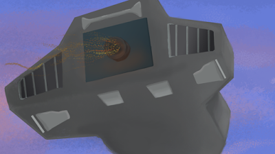 I decided to add a gradient to the grates to give a 3D effect so it has depth.
 Lastly I put a glow effect from the sun.
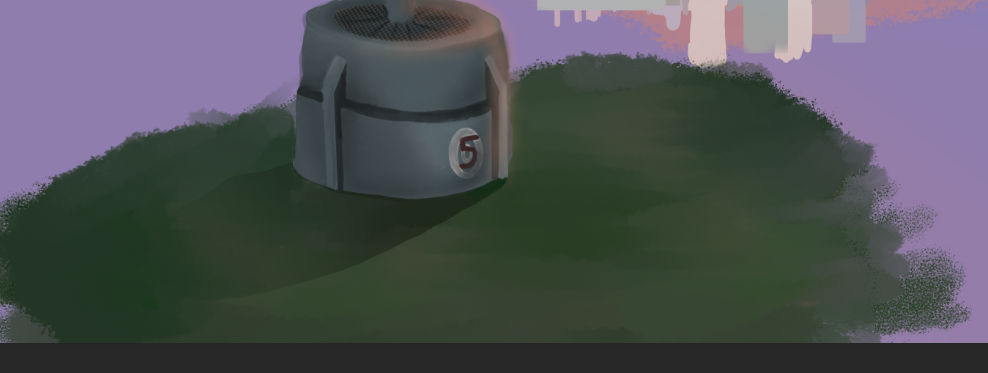
 For the city I did change the saturation to make it lighter so it gave the effect it was in the distance. I also added in more buildings to give the effect that its a compact city and not just a few buildings.
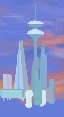
I then did add some very light shading and lines for windows, I didn't want to add much due to it being far away that you wouldn't be able to make out the smaller details anyway.
 Lastly, for the city I added a light glow going up the sides of the buildings as well as a gradient to give the effect of the sun coming from behind and shining light on the buildings.

I did have some trouble with the grass to start off with as I didn't know if I wanted a texture or not. After some experimenting I found a wet brush and used that to layer up the grass and add in some dirt. I blended it with another textured brush lightly.
 After that I once again added in a gradient around the edges away from the city for the shadows and then added a orange gradient for the sunlight.

The last thing on the list was the trees that i wanted circling around the tower and leading off towards the city. I added in two big trees either side to give some perspective. I used a brush tree texture for them.
 I put another gradient over the trees for the shadow.

I then added in some leaf textures for the big trees.
 For the smaller trees I wanted three layers of them going off into the distance. I once again had to experiment with what texture to use for them. The idea was a that the further into the distance they are the less saturated and visible they get. I tried to mix up the greens so the trees wouldn't get merged together and look clumped.
 Then came in the second line of trees, less saturated and bigger so they can be seen.

The third line of trees ended up almost completely gray which I did end up liking in the end, I did have to test out some colors so it looked natural as they faded off. I would like to add in some leaf detail to them but due to their size it doesn't look good or natural so I'll have to stick to solid trees for now.

Here is the final imagine worlds concept art with the updated ship.
I am happy with how this turned out although I did struggle to get into it at the beginning. Next time I want to add in more detail with the trees, I would also like to put in more detail with the city as well but I didn't know how with how far back the city is. I did end up very proud of the sky and the ship in the end even though I struggled first.


I then moved onto the watch tower, I did the base colors first and put dark colors where I knew there would be more shadows.


This is the full shaded tower, I used a textured brush when smudging but I had difficulty doing so as I really don't like Photoshop's blending tools and prefer Krita's as it gives a much smoother finish and blends it in easier. I also added in Windows and some smaller details like the number.
Next I got a image of a grate from google and put it in the center of the tower next to the first pole, although its barely noticeable you can still see its got some detail. I also added in a glow from the sun and a shadow.


I once again went on Google and got an image of drone fans/blades and then edited them on using the warp tool.

For the final part of the drone I added in the glow again form the sun and I used a gradient to make it look like the drone has a search light.

Moving onto the ship I did a basic one that I'm not too happy about.


I then did add some very light shading and lines for windows, I didn't want to add much due to it being far away that you wouldn't be able to make out the smaller details anyway.

I did have some trouble with the grass to start off with as I didn't know if I wanted a texture or not. After some experimenting I found a wet brush and used that to layer up the grass and add in some dirt. I blended it with another textured brush lightly.


The last thing on the list was the trees that i wanted circling around the tower and leading off towards the city. I added in two big trees either side to give some perspective. I used a brush tree texture for them.


I then added in some leaf textures for the big trees.


The third line of trees ended up almost completely gray which I did end up liking in the end, I did have to test out some colors so it looked natural as they faded off. I would like to add in some leaf detail to them but due to their size it doesn't look good or natural so I'll have to stick to solid trees for now.

Here is the final imagine worlds concept art with the updated ship.
I am happy with how this turned out although I did struggle to get into it at the beginning. Next time I want to add in more detail with the trees, I would also like to put in more detail with the city as well but I didn't know how with how far back the city is. I did end up very proud of the sky and the ship in the end even though I struggled first.
Comments
Post a Comment