Imagine Worlds - Artist Analysis: Dave Phillips
Practice
Dave Phillips is an independent concept artist and game developer, he is most noted for his concept art for games such as Destiny 2, Skylanders Swap Force/ Superchargers and Spyro's Adventure. He has worked as the lead concept artist for Vicarious Visions a game developer company between October 2005 to July 2017 where he did concept art fort he games listed previously. Additionally he was the principal concept artist for Carbine Studios for a year in July 2017.He also freelanced in children s literature and film. Phillips also studied at the Art Institute of Washington where he got a Bachelor of Fine Arts in Media Arts, Animation, Interactive Technology, Video Graphics and Special Effects.
 Environment
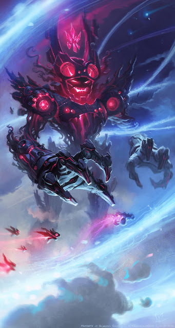
In this concept art from Skylanders Superchargers Phillips clearly tries to depict a space environment in this artwork, its easy to see by the way the background colors fade from a lighter sky blue to a darker blue with the clouds also stopping along the darker areas. Not only that but the spaceships and giant robot which are commonly linked to space give it away. With this art actually depicting the final boss fight in the game I think the environment adds perfectly to the scene, having a fight in space adds to the extremity of the fight for the players. Comparing the environment of the image above to the one below although Phillips has used similar colors and themes the environment in the second image is much more closed off inside a building with less space to move whereas the top image being in space also helps show the scale of the boss compared to the world around them.
 Tone
Tone
Additionally the tone of the first piece is positive, the heroes circling the boss with flashes of blue that surround him contrast against the purples and reds the boss is emitting. Phillips is trying to show through these shades and hue of blue that the players are winning as that is the majority color in the art and on closer inspection the left arm of the boss is almost engulfed in this blue light. Whereas the use of darker reds and purples for the boss you can see slowly trying to take over in the sky above his head. On the other hand the tone in the second image is far more negative and darker than the first. The majority theme is dark reds and grays whilst there is very little blue standing out. The two parallel each-other with these colors, the second shows the vibrant red of the enemy spreading across the art work, compared to in the first image its the bright blues that are instead taking up the image.
Furthermore the use of the bright blues coming off the player in the second image draws your attention in immediately to them, as if they are a guiding light in contrast to the reds that surround them. Once again, comparing to the first image it does the same thing as the second only in reverse. Blues being the main color of the first piece the reds of the boss stand out and draw your attention to him not the players. Both use colors well to depict the tone of the art similarly but they also contrast each other.
Application
Lastly, Phillips conceptual artworks were applicated into the Skylanders Superchargers game. The first piece was very similar to the final product in the game, with the players driving around the boss in space trying to shot at him and dodge attacks. They also kept true to the immense scale of the boss in the art as he is roughly the same size in the game. Although in the game the quality is no where near as impressive as the art work and it does not give off the same intense feeling in the game. The road the player drives on does not have the vibrant blues in the art and they made it more solid. Adding on, the main boss itself does not have the harsh red tones coming from him that contrast against the blues.

The second artwork was also used in the game as the fight before the final but once again the art out shined the finished product. The eerie atmosphere of the image was taken away and stripped down to bare minimum in the end. The red lights taking over the scene were gone and the electric spikes coming form the ground were replaced by red cubes. The entire level ended up very lackluster and disappointing when looking back at Phillips concept art. They even removed the eye catching blue highlights from the player and window that stood out in the sea of purples and reds coming from the boss.

Dave Phillips is an independent concept artist and game developer, he is most noted for his concept art for games such as Destiny 2, Skylanders Swap Force/ Superchargers and Spyro's Adventure. He has worked as the lead concept artist for Vicarious Visions a game developer company between October 2005 to July 2017 where he did concept art fort he games listed previously. Additionally he was the principal concept artist for Carbine Studios for a year in July 2017.He also freelanced in children s literature and film. Phillips also studied at the Art Institute of Washington where he got a Bachelor of Fine Arts in Media Arts, Animation, Interactive Technology, Video Graphics and Special Effects.

In this concept art from Skylanders Superchargers Phillips clearly tries to depict a space environment in this artwork, its easy to see by the way the background colors fade from a lighter sky blue to a darker blue with the clouds also stopping along the darker areas. Not only that but the spaceships and giant robot which are commonly linked to space give it away. With this art actually depicting the final boss fight in the game I think the environment adds perfectly to the scene, having a fight in space adds to the extremity of the fight for the players. Comparing the environment of the image above to the one below although Phillips has used similar colors and themes the environment in the second image is much more closed off inside a building with less space to move whereas the top image being in space also helps show the scale of the boss compared to the world around them.

Additionally the tone of the first piece is positive, the heroes circling the boss with flashes of blue that surround him contrast against the purples and reds the boss is emitting. Phillips is trying to show through these shades and hue of blue that the players are winning as that is the majority color in the art and on closer inspection the left arm of the boss is almost engulfed in this blue light. Whereas the use of darker reds and purples for the boss you can see slowly trying to take over in the sky above his head. On the other hand the tone in the second image is far more negative and darker than the first. The majority theme is dark reds and grays whilst there is very little blue standing out. The two parallel each-other with these colors, the second shows the vibrant red of the enemy spreading across the art work, compared to in the first image its the bright blues that are instead taking up the image.
Furthermore the use of the bright blues coming off the player in the second image draws your attention in immediately to them, as if they are a guiding light in contrast to the reds that surround them. Once again, comparing to the first image it does the same thing as the second only in reverse. Blues being the main color of the first piece the reds of the boss stand out and draw your attention to him not the players. Both use colors well to depict the tone of the art similarly but they also contrast each other.
Application
Lastly, Phillips conceptual artworks were applicated into the Skylanders Superchargers game. The first piece was very similar to the final product in the game, with the players driving around the boss in space trying to shot at him and dodge attacks. They also kept true to the immense scale of the boss in the art as he is roughly the same size in the game. Although in the game the quality is no where near as impressive as the art work and it does not give off the same intense feeling in the game. The road the player drives on does not have the vibrant blues in the art and they made it more solid. Adding on, the main boss itself does not have the harsh red tones coming from him that contrast against the blues.

The second artwork was also used in the game as the fight before the final but once again the art out shined the finished product. The eerie atmosphere of the image was taken away and stripped down to bare minimum in the end. The red lights taking over the scene were gone and the electric spikes coming form the ground were replaced by red cubes. The entire level ended up very lackluster and disappointing when looking back at Phillips concept art. They even removed the eye catching blue highlights from the player and window that stood out in the sea of purples and reds coming from the boss.

Comments
Post a Comment